Brand
Brand Guidelines
These guidelines outline the appropriate way to use our brand image. For any questions about the content or proper use, get in touch with us. We'll be more than happy to help you out.
Our Logo
This is the cornerstone of the Sophilabs identity: modern and friendly, yet solid, clear, and direct while exhibiting a strong presence.
The full mark (glyph + wordmark) is the standard version. This is the right one to use in most cases.
Do not edit, distort or change the color of any mark.
Download
Sophilabs’ logo, wordmark and glyph.
In circumstances where the logo will be placed over a dark background, you must use the knockout version. Download Sophilabs’ logo knockout, wordmark knockout and glyph knockout.



The wordmark works great alone, and you can use it instead of the full logo.
This is the minimal expression of the brand. Use it when you have limited space, like in favicons or avatars.
Safety Space
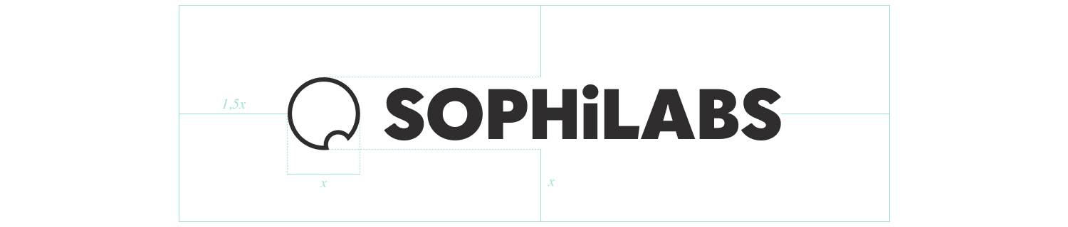
When using the Sophilabs logo with other graphic elements or close to the edge of a page, keep at least a 1x safety space around the top and bottom of the logo and 1.5x around the right and left sides, where the width of the glyph is the measure of x.
Spelling
We only use title cases to write the brand. Avoid any other written form as sophilabs, SophiLabs, sophi labs or any strange combination.
Social assets
Drawn by the site from the same tokens and typefaces as the pages, so a colour that moves in the stylesheet moves here on the next deploy. None of these is a file kept somewhere — each link renders the current one.
Every page also has its own share card at 3600×1890, which is what Slack and LinkedIn draw when a link is pasted. There is no list of those: paste the page.
Logo
The marks as files, for fields that ask for a logo rather than a page. The glyph is what the structured data every page carries points at: that field is drawn small and square.

Company page
LinkedIn crops the cover from the sides on a narrow window and lays the avatar over its lower left, so nothing readable sits in either place. The first is the cover; the rest are the slideshow behind it.
Profile
A different shape and a different obstruction: a member’s avatar is a circle, and a much bigger one, so this is not the company cover rescaled.
- Profile cover4752 × 1188Personal profile
Highlights
One drawing on paper and no words: at the size LinkedIn draws these, a word is a texture.
- Trajectory384 × 384Featured highlight cover
- Passed384 × 384Featured highlight cover
- Written384 × 384Featured highlight cover
Portfolio
The project cards on the Clutch profile. One line of type and the room around it: at this size a drawing is a smudge and a paragraph is two lines nobody reads in a grid.
- Amgen1500 × 1050A voice assistant for a field sales team
- Oxford Economics1500 × 1050A platform that delivers economic analysis the day it matters
- CareerVillage1500 × 1050Career advice that reaches students on the phone they actually have
- Envio3601500 × 1050Optimisation for drayage, on top of the systems companies already run
- Auth01500 × 1050Seven years inside Auth0
- Field note1500 × 1050How we rebuilt our own technical hiring with AI
- OneGoal1500 × 1050AI development and maintenance for the OneGoal API
Carousel
Eight pages at 4:5, which is the tallest a post is shown at. Upload it as a document post — LinkedIn rasterises every page, which is why the last one prints the address instead of linking it.
- AI Discovery Sprint3240 × 4050Document post · 8 pages